SARS-CoV-2 Cartograms
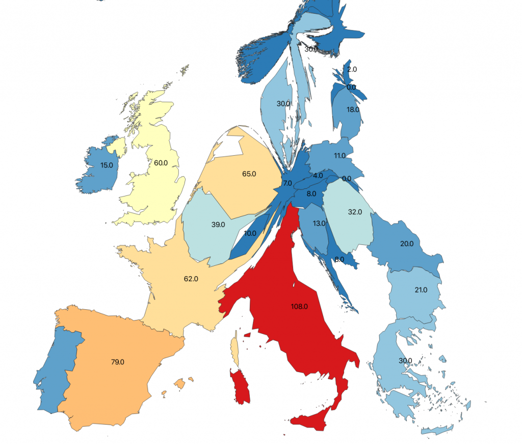
Europe: death rate per 1000 infected persons in Europe based on data from the European Centre of Disease Control and Prevention. (https://www.ecdc.europa.eu/en/cases-2019-ncov-eueea), status: 29.03.2020:
Cartogram reprojected data using ESRI vector base dataset for Europe.
Cartogram: SARS-CoV-2 mortality – calculated as deaths per 1000 infections in Europe – cartogram reprojected using death/infected as relative area value – status 29-03-2020 – data source: ECDC. 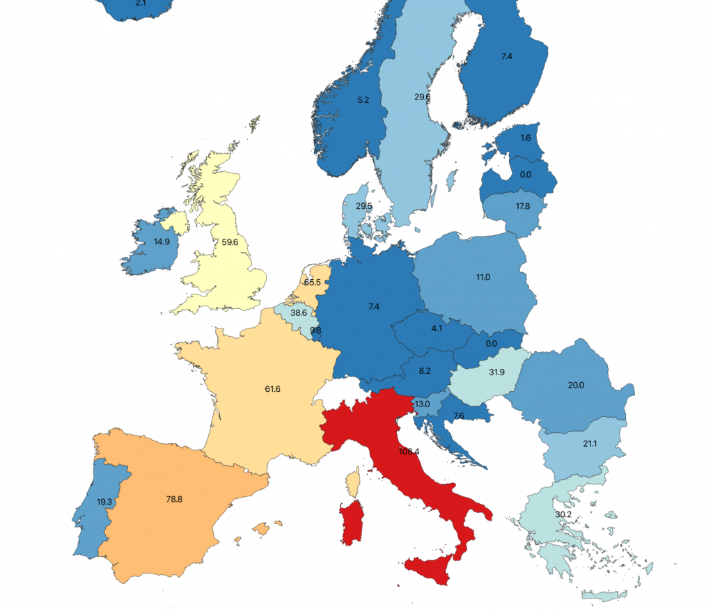
29-03-2020:
SARS-CoV-2 mortality – calculated as deaths per 1000 infections in Europe – choropleth map – status 29-03-2020 – data source: ECDC.
Update with data from 29-03-2020. Legend removed for quicker upload. The data is slightly distorted since not all federal states report infection numbers regularly on a daily basis (data source RKI):
29-03-2020:
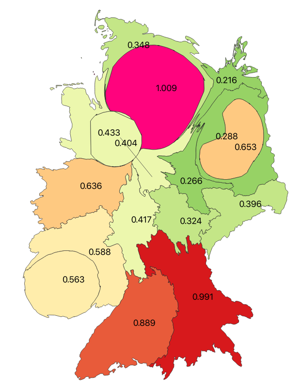
SARS-CoV-2 infections per 1000 inhabitants cartogram equal density reprojected for the federal states of Germany – status 29-03-2020 – data source RKI.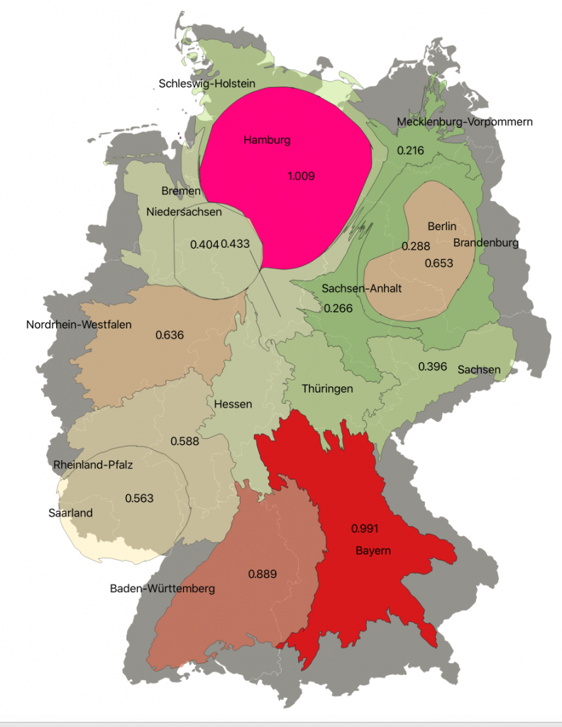
29-03-2020:
SARS-CoV-2 infections per 1000 inhabitants cartogram equal density reprojected for the federal states of Germany – status 29-03-2020 – data source RKI – backdrop original geometry of the federal states of Germany
Since the SARS-CoV-2 numbers are changing so quickly – this is a good occasion to work with some specific visualization/mapping techniques. Some population and infection normalized Cartogram reprojections to visualize SARS-CoV-2 status in Germany:
14-03-2020:
SARS-CoV-2 infections per federal state – cartogram equal density reprojected for the federal states of Germany – status 14-03-2020 – data source RKI – backdrop original geometry of the federal states of Germany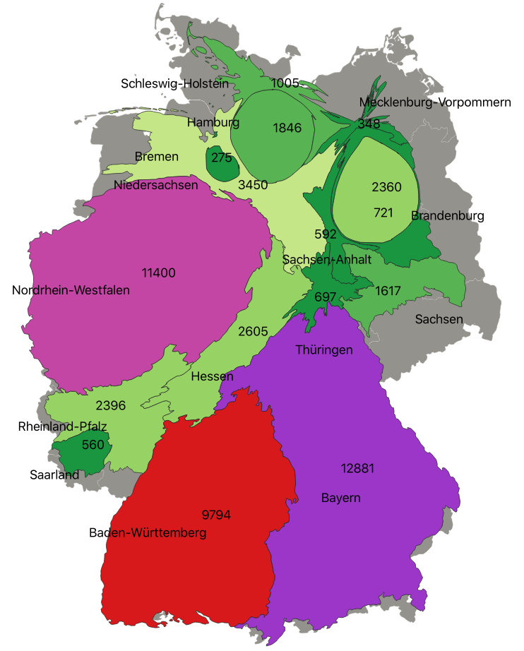
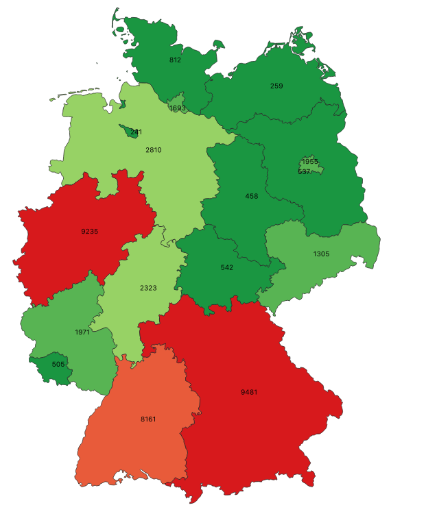
29-03-2020:
SARS-CoV-2 infections per federal state – cartogram equal density reprojected for the federal states of Germany – status 29-03-2020 – data source RKI – backdrop original geometry of the federal states of Germany
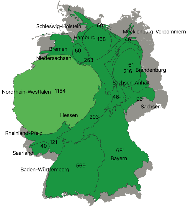
SARS-CoV-2 infections per federal state.
Cartogram projection using number of infections per federal state as area value and recalculating density and resulting geometry of the underlying vector dataset.
A Cartogram can visualize the distribution of infections in Germany much better than a standard choropleth map – this is especially valid if we use the Cartogram style combined with a normalized value using “per inhabitants” – in this figure: infections per 1000 inhabitants. Now the infection numbers are related to inhabitants and this shows clearly where the highest density of infections occurred after normalization with inhabitants. Its also what we expect since dense metropolitan regions will likely cause higher infection rates. Note that using both the color and the size for the geometry for communication of the thematic value (infections per 1000 inhabitants) is very powerful to describe the information – however the original proportions of the objects (federal states of Germany) is completely lost – therefor its important to have the original projection as reference (scroll to end of page):
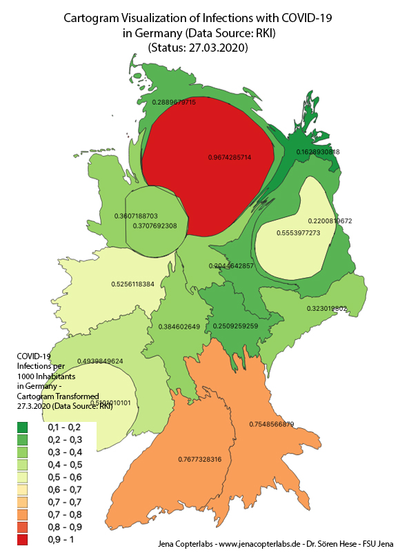
Infections per 1000 inhabitants – equal interval classification. Hamburg has as of 27-03-2020 the most infections per 1000 inhabitants (0.96).
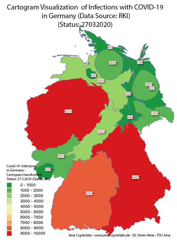
Conventional choropleth map would look like this: you might get the impression that its dangerous to go to the south of Germany but normalized to inhabitants its maybe more likely that you meet someone infected in Hamburg (though not true since positive tested people are in quarantine right now).
Usual choropleth map concept – here UTM32 WGS84 showing the infection numbers at the 27th of March 2020 (data source: RKI 27032020)
We will reprocess with the new numbers in the weeks to come and also some new change mapping concepts will be shown here. Data used: status data (27.03.2020) from RKI and spatial data from BKG (Bundesamt für Kartographie und Geodäsie):
- Dougenik, J. A, N. R. Chrisman, and D. R. Niemeyer. 1985. “An algorithm to construct continuous cartograms.” Professional Geographer 37:75-81